Shaker Cup Product Line
Field
Client / Employer
Gamer Supps
The Challenge
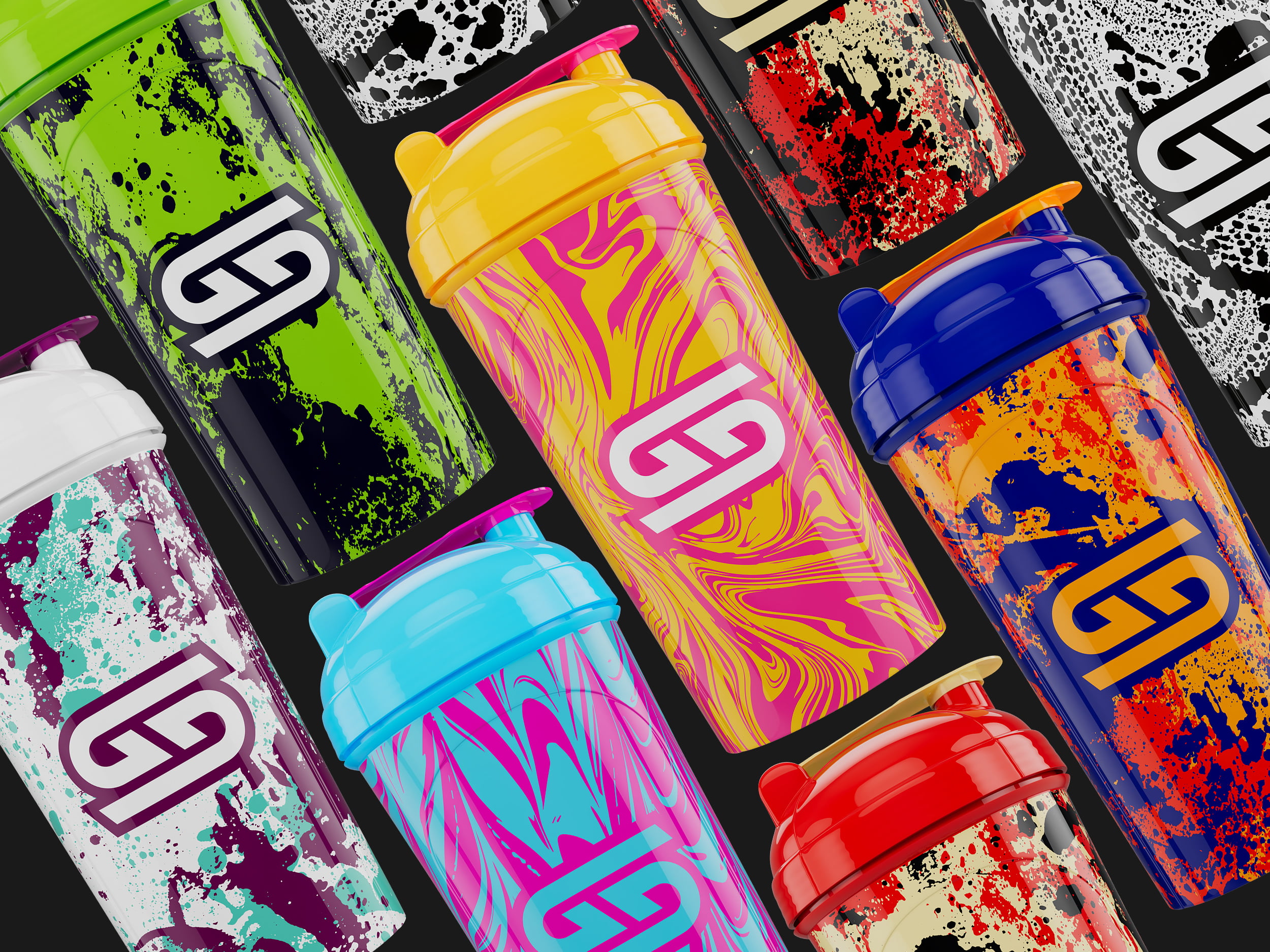
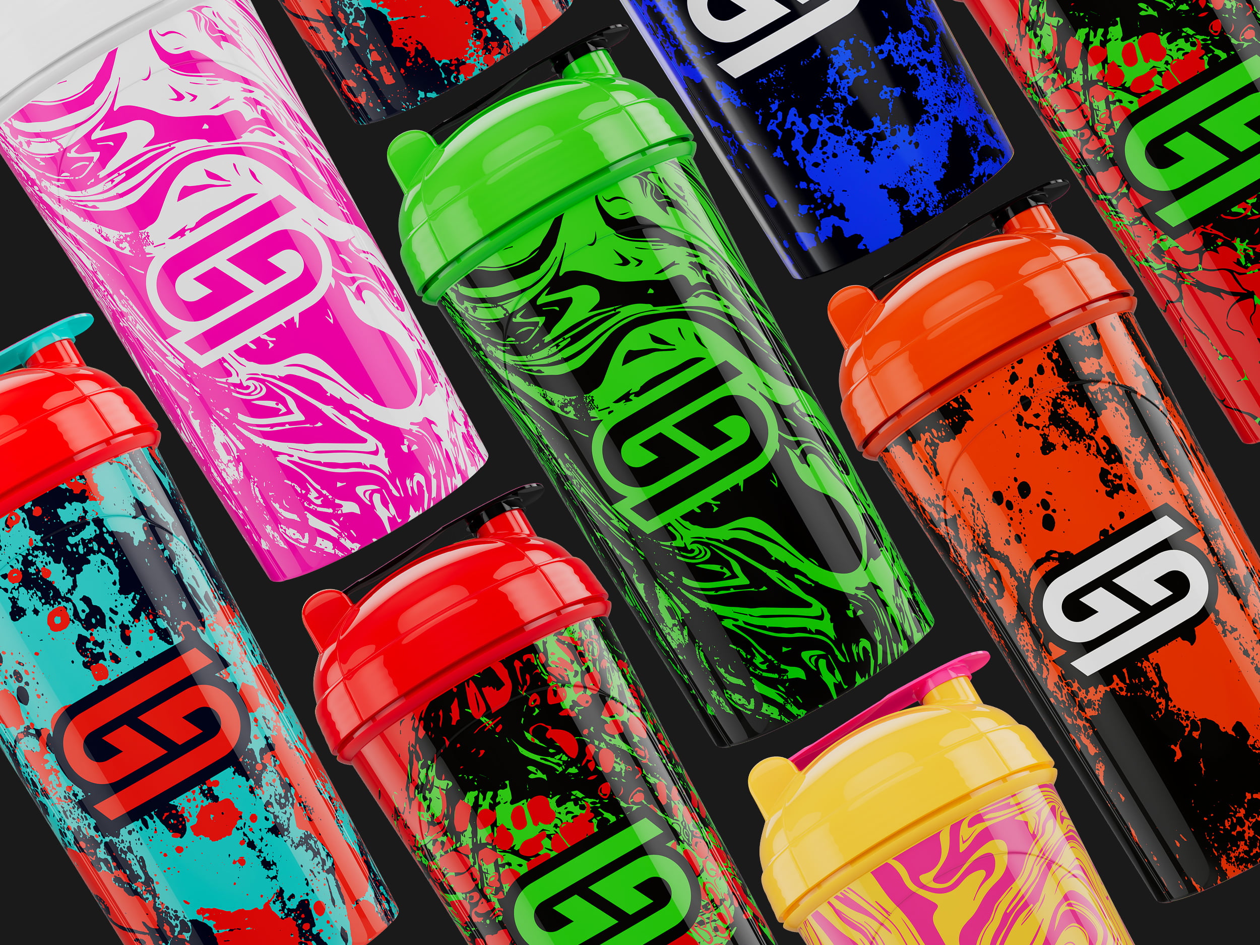
The objective was to design a series of high-impact shaker cups that utilized the Gamer Supps logo as the primary visual driver. The challenge lay in creating a “grungy,” streetwear-inspired aesthetic that felt premium and collectible while working strictly within the technical dielines provided by the manufacturer.
The Solution
To elevate the brand’s hardware, I engineered a series of Gamer Supps shaker designs using All-Over Print (AOP) wrap-around graphics that transformed the standard clear bottle into a bold brand statement. By utilizing high-contrast textures and distressed logo placements, I created a visual language that resonated with the brand’s core gaming audience. I meticulously applied these graphics to the existing manufacturer dielines, optimizing the artwork for the hardware’s specific printable surface. To create a fully custom finished product, I hand-selected Pantone colors for the lids, gaskets, and shaker inserts, ensuring the plastic components were a perfect color match to the printed artwork.
Key Results
- Technical Execution: Successfully adapted complex, textured designs to factory-provided specifications across 15+ high-volume runs.
- Production & Quality: Managed the Pantone matching process to ensure the physical hardware and printed art felt like a single, unified product with high visual fidelity and color vibrancy.